★CSS3リファレンス
radial-gradient() …… 円形グラデーションを指定する


広告
radial-gradient()関数は、円形グラデーションを指定する際に使用します。
■構文
radial-gradient(形状とサイズ at 中心位置, 開始色, 途中色, 終了色);
■値
- グラデーションの中心位置
- at に続けて left, center, rightや、top, center, bottom などの位置を表すキーワード、または、0%, 50%, 100% などの%値でグラデーションラインの中心位置を指定。初期値は center
- 形状
- circle(円)、ellipse(楕円)のいずれか。初期値は ellipse
- サイズ
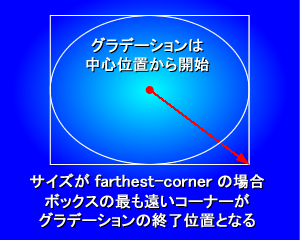
- グラデーションのサイズを以下のキーワードで指定。初期値は farthest-corner
closest-side …… ボックスの最も近い辺がグラデーションの終了位置となる
farthest-side …… ボックスの最も遠い辺がグラデーションの終了位置となる
closest-corner …… ボックスの最も近いコーナーがグラデーションの終了位置となる
farthest-corner …… ボックスの最も遠いコーナーがグラデーションの終了位置となる(初期値)
- 開始色, 途中色, 終了色
- 開始色, 途中色, 終了色を指定。 必要に応じて各色の開始位置を半角スペース区切りで指定することもできます。 例えば、red, yellow, skyblue と指定すれば均一に変化するグラデーションとなりますが、red 50px, yellow 70px, skyblue 100px などと指定すれば各色がどの位置から始まるかを指定できます。
円形グラデーションは、グラデーションの中心位置、サイズ、形状を定義することで作成されます。 グラデーションは中心位置から始まり、 外側の形状(circle、ellipse)に向かって進み、 指定されたサイズ(closest-side、farthest-side、closest-corner、farthest-corner)に合わせて終了します。
radial-gradient()関数は、 background-imageプロパティや list-style-imageプロパティなど、 画像を扱うことのできるプロパティの値として指定できます。 以下の使用例では、 backgroundプロパティの値にradial-gradient()関数を使用しています。
以下は、radial-gradient()関数の様々な使用例です。
■使用例
CSSソースは外部ファイル(sample.css)に記述
p.sample1, p.sample2, p.sample3, p.sample4, p.sample5 {width:300px; height:100px;
}
p.sample1 {
background: radial-gradient(red, skyblue);
}
p.sample2 {
background: radial-gradient(ellipse farthest-side, red, yellow, skyblue);
}
p.sample3 {
background: radial-gradient(circle farthest-side, red, yellow, skyblue);
}
p.sample4 {
background: radial-gradient(circle, red 50px, yellow 70px, skyblue 100px);
}
p.sample5 {
background: radial-gradient(circle at top left, red 50px, yellow 70px, skyblue 100px);
}
HTMLソース
<html><head>
<link rel="stylesheet" href="sample.css" type="text/css">
</head>
<body>
<p class="sample1">円形グラデーション1</p>
<p class="sample2">円形グラデーション2</p>
<p class="sample3">円形グラデーション3</p>
<p class="sample4">円形グラデーション4</p>
<p class="sample5">円形グラデーション5</p>
</body>
</html>
↓↓↓
ブラウザ上の表示
円形グラデーション1
円形グラデーション2
円形グラデーション3
円形グラデーション4
円形グラデーション5
■ベンダープレフィックスを付けた場合の使用例
CSSソースは外部ファイル(sample.css)に記述
p.prefix_sample1, p.prefix_sample2, p.prefix_sample3, p.prefix_sample4, p.prefix_sample5 {width:300px; height:100px;
}
p.prefix_sample1 {
background: -moz-radial-gradient(red, skyblue);
background: -webkit-radial-gradient(red, skyblue);
background: -ms-radial-gradient(red, skyblue);
}
p.prefix_sample2 {
background: -moz-radial-gradient(ellipse farthest-side, red, yellow, skyblue);
background: -webkit-radial-gradient(ellipse farthest-side, red, yellow, skyblue);
background: -ms-radial-gradient(ellipse farthest-side, red, yellow, skyblue);
}
p.prefix_sample3 {
background: -moz-radial-gradient(circle farthest-side, red, yellow, skyblue);
background: -webkit-radial-gradient(circle farthest-side, red, yellow, skyblue);
background: -ms-radial-gradient(circle farthest-side, red, yellow, skyblue);
}
p.prefix_sample4 {
background: -moz-radial-gradient(circle, red 50px, yellow 70px, skyblue 100px);
background: -webkit-radial-gradient(circle, red 50px, yellow 70px, skyblue 100px);
background: -ms-radial-gradient(circle, red 50px, yellow 70px, skyblue 100px);
}
p.prefix_sample5 {
background: -moz-radial-gradient(circle at top left, red 50px, yellow 70px, skyblue 100px);
background: -webkit-radial-gradient(circle at top left, red 50px, yellow 70px, skyblue 100px);
background: -ms-radial-gradient(circle at top left, red 50px, yellow 70px, skyblue 100px);
}
HTMLソース
<html><head>
<link rel="stylesheet" href="sample.css" type="text/css">
</head>
<body>
<p class="prefix_sample1">円形グラデーション1</p>
<p class="prefix_sample2">円形グラデーション2</p>
<p class="prefix_sample3">円形グラデーション3</p>
<p class="prefix_sample4">円形グラデーション4</p>
<p class="prefix_sample5">円形グラデーション5</p>
</body>
</html>
↓↓↓
ブラウザ上の表示
円形グラデーション1
円形グラデーション2
円形グラデーション3
円形グラデーション4
円形グラデーション5
■関連項目
linear-gradient()関数 …… 線形グラデーションを指定する
radial-gradient()関数 …… 円形グラデーションを指定する
repeating-linear-gradient()関数 …… 繰り返しの線形グラデーションを指定する
repeating-radial-gradient()関数 …… 繰り返しの円形グラデーションを指定する
radial-gradient()関数 …… 円形グラデーションを指定する
repeating-linear-gradient()関数 …… 繰り返しの線形グラデーションを指定する
repeating-radial-gradient()関数 …… 繰り返しの円形グラデーションを指定する
広告
Sponsors
広告
MuuMuu Domain!
ドメイン取るならお名前.com
現役エンジニアのオンライン家庭教師【CodeCamp】
サイトに広告を掲載してお小遣いが稼げる!【A8.net】
© HTMQ